

I just purchased an old book called 10,000 Years of Art by Phaidon. It chronicles art pieces the world over, from the earliest stencils on cave walls to the varied and contemporary types of art that we see today. The feature that I loved most about this little handbook though, is that you get to see art from different places around the world adjacent to one another. So you know that when Vermeer was painting the The Milkmaid in Netherlands, the Chinese were busy with their landscape painting while pear-shaped bottles with long necks were popular in Iran.
I took up a very basic course of Art Appreciation back in college. And though the course followed a chronological timeline of important milestones in humanities, only western art imprinted on my mind. I’m not sure whether we had a discussion on how to appreciate eastern art (or art that came from this part of the world) but there is really little that I know about the brilliant works that has sprung from here. And this book somehow gave me an idea on the wonderful craftsmanship and creativity from our part of the world.
Today, we start off with the Japanese screen panel art. Some pieces featured here date back as early as 1540, around the same time Mannerism and Northern Renaissance were sweeping Europe with works like the Hall of the Giants by Giulio Romano in Italy, Salome with the Head of John the Baptist by Lucas Cranach the Elder in Germany and the Saltcellar by Benvenuto Cellini in France.
The latest featured piece dates back in 1710, 40 years before Mr. and Mrs. Andrews was painted in Rococo style by Thomas Gainsborough in United Kingdom.
Byôbu, the Japanese term for folding screens, functions both as furnishing and decoration. It literally means protection against the wind. When used outdoors, it can function as portable walls, demarcating space and shielding revelers from prying eyes.

This first piece of art, called Wagtails, Pine and Waterfall, is the work of Kano Motonobu (1476-1559). It was done during the late Muromachi Period, the same period when the tea ceremony, flower arranging and other art of all kinds began to flourish in Japan.
What’s most interesting about this work is the contrast provided by the upward path of the old pine and the forceful downward fall of the water behind it, while the wagtails and other birds stand in silent awe. The combination of vitality with permanence and grandeur presented in the panel are qualities most denoted from the Kano school imagery.
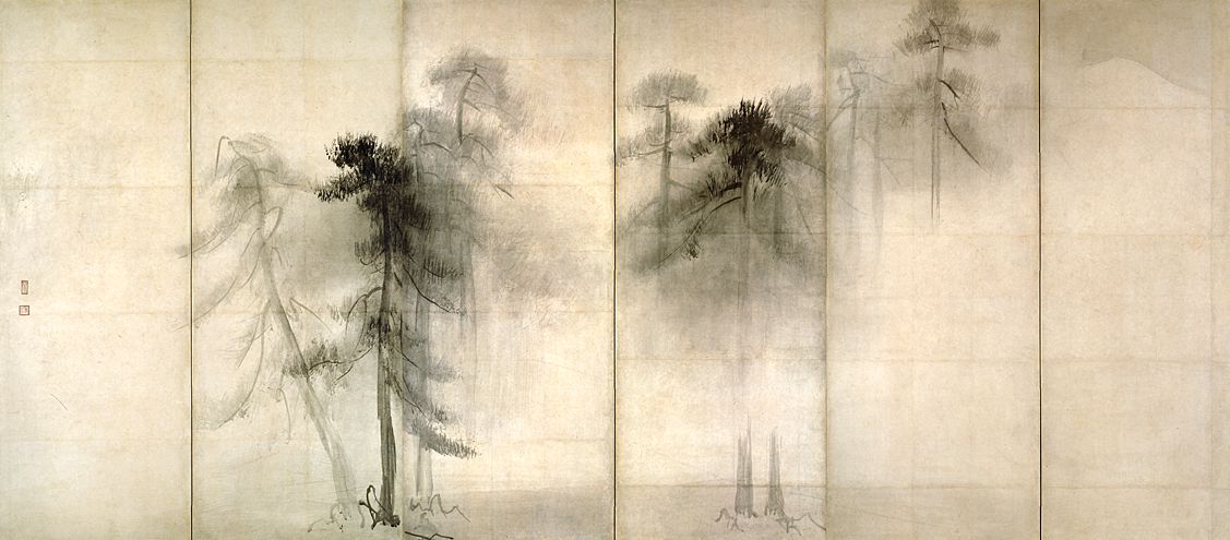
We jump over a 40-year period to this work of Hasegawa Tohaku ( 1539 – 1610) called Pine Forest. Such great technique he has to achieve such sublime subtlety. I may not be familiar on how to use India ink or the intricate steps this artist had to take to come up with this (Phaidon gave it in detail), but this is really beautiful.
So as this work borne out of collaboration between Tawaraya Sotatsu and Hon’ami Koetsu called Cranes. Sotatsu defied convention by radically simplifying the forms of the bird so that they appear identical, but each bird retained a unique, lively and varying positions.

These two works, one a folding screen and the other a narrative hand scroll, were created during the Momoyama period where both lavish and rustic simplistic styles of art found supporters from different tiers of society.

In 1670, Tosa Mitsuoki (1617 – 1691) created Spring Cherry with Poem Slips. This features colorful painting style contrasted with the monochrome Chinese ink style as seen in Wagtails, Pine and Waterfall. A lengthy analysis and description of this work can be found here.
Last but definitely not the least, we have Ogata Korin‘s Flowering Irises. Dubbed as the most popular-almost overfamiliar-design in all of Japanese art, this piece is created using only three colors – ultramarine, copper blue and malachite. And the most splendid thing is that no petal nor leaf share the same stroke. This image is only a screen grab from Columbia.edu where you can find detailed explanation for each highlighted part of this byôbu.

Japanese art are not limited to folding screens or hand scrolls, of course, and there have been many significant art pieces made before all these. But aside from Ukiyo-e, these really captured my attention. Maybe I will post about the art in Late Edo period but that’s for another day. I hope you learned much from this post as much as I had while scouring the net for more information. May your appreciation for these work of art deepened.
Ja ne!
Other helpful links:
Cranes, Tawaraya Sotatsu and Hon’ami Koetsu
